DISCOVER HOW RADAR GRAPHS MAKE PERFORMANCE DATA ACTIONABLE, HELPING YOU TARGET WEAKNESSES AND OPTIMIZE TRAINING
Objective data can be a game-changer in a world of guesswork. Training programs often rely on reps, sets, load, tempo, and perceived effort, which are good, but they don’t always reveal if you’re improving performance-driving qualities.
Measuring force, power, and speed is crucial to identify specific strength qualities to focus on. It’s easy to get someone stronger, but how do you know when they’re strong enough? How do you know if they need to improve power? And if they do, how do you know the best ways to train for more power output if it can’t be measured? These questions puzzled me, and I often found my answers lacking.
HOW RADAR GRAPHS WORK
A radar graph—sometimes called a spider chart or web chart—is a visual tool that maps out multiple performance metrics in a single, circular graph. Each “spoke” represents a different variable (like horizontal push or core rotation), and the distance from the center reflects your performance level.
The further out you go on each axis, the better your performance. When plotted, the result is a shape-usually not symmetrical. And that is the point.
You want to target your weaknesses and expand the whole shape outward, not just inflate one area.
It’s especially useful in athletic training because it allows coaches and athletes to see asymmetries, deficiencies, and standout strengths and weaknesses all at once. Instead of sifting through rows of data, you can instantly spot where attention is needed.
WHAT MAKES THIS POWERFUL?
- Objective Feedback: You’re not relying on feel. You’re tracking performance.
- Targeted Adjustments: You’re not throwing everything at the wall and seeing what sticks. You’re fixing what’s weakest.
- Progress You Can See: Re-test and watch your radar shape grow.
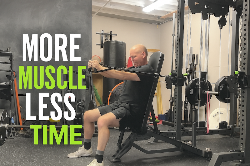
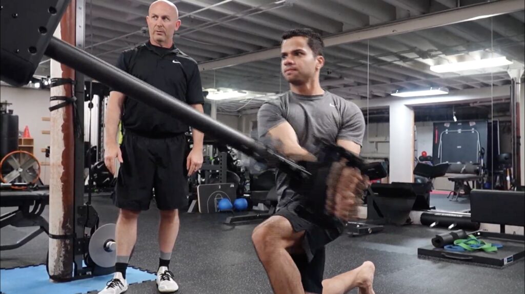
At Ascend, we use the Proteus Motion, a 3D resistance training and testing platform. It allows for full-body, multi-planar testing and automatically produces a radar graph, along with a bunch of other useful data metrics from your test results. This provides an immediate snapshot of strengths, power-speed deficits, and concerning asymmetries that could increase injury risks or hinder performance.
A REAL EXAMPLE: THE POWER MAP
Here’s a snapshot of a Proteus Motion Power Map of an athlete:
[The image was from their assessment]
Each category—like Upper Body Horizontal Push, Core Rotation, or Lower Body Vertical Push—is plotted based on percentile. For example:
- Upper Body Horizontal Push: 86th Percentile (a key strength)
- Lower Body Vertical Push: 42nd Percentile (an area for improvement)
- Elbow Extension: 76th Percentile
- Core Rotation: 52nd Percentile
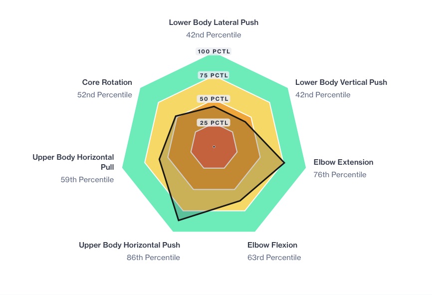
This gives a clear, visual representation of performance balance. This athlete’s power output is lagging in both lower body movements, which makes sense because he suffered a knee injury in his sport jiu-jitsu. His training can be adjusted accordingly—targeting more emphasis on vertical and lateral push mechanics through increase volume and/or frequency.
WHY VISUALIZING DATA MATTERS
Numbers are valuable—but pictures are actionable. A radar graph takes raw data and makes it accessible, especially for athletes who might not be used to interpreting complex metrics. It gives context to your training decisions:
- Where am I underperforming?
- Which patterns are improving over time?
- Am I training evenly, or compensating on one side of the body?
It also adds motivation: improvements on the graph are visible, which helps athletes connect training to tangible progress.
TRANSLATING DATA TO ACTION
Let’s say an athlete shows strong scores in upper body pushing and pulling, but weak scores in core rotation and vertical pushing. This tells us a few things:
- They may be over-reliant on upper body dominant lifts.
- Their lower-body explosive power might be underdeveloped.
- Programming should shift to emphasize rotational core work, unilateral power development, and vertical loading patterns.
This type of specificity simply isn’t possible without data—and radar graphs make that data practical.
FROM INSIGHT TO IMPACT
Radar graphs aren’t magic-but they are a powerful tool.
They give you visual, actionable data-so you can stop guessing and start targeting the things that matter most.
Train smarter. Get better, Build the complete version of yourself.
READY TO SEE YOUR OWN PROTEUS ASSESSMENT RESULTS?
If you’re curious about how you stack up-or where your blind spots are-book a testing session at Ascend. We’ll break down your performance metrics and build a plan tailored to you.